

Raise your hand if you’ve ever wasted hours (or days!) trying to figure out who’s available to work on a project. 👋 Yeah, me too. Have you ever worked somewhere that felt like the Wild West of project management? You know, the kind of place where spreadsheets and emails reign supreme, and finding out who’s available for a task is like searching for a needle in a haystack? Yeah, I’ve been there, and it’s not fun. Even in big companies, sometimes it feels like no one’s thought about how to make things run smoothly. It’s not just about the production teams, either; it’s also about the managers trying to keep everything on track.
The Problem: Spreadsheet Chaos
When I joined the operations team, I quickly realised that projects would land on our desks with tight deadlines, but we’d struggle to find the right people to work on them. It wasn’t that we didn’t have enough talented folks; it was that they were scattered across different projects or just waiting for their next assignment. The process was a mess: we’d have to reach out to every team lead, wait for them to check their team’s availability, and then maybe we’d get a list of names. It could take days just to get a project off the ground!
- We seize opportunities to innovate and grow
- We are one firm with a shared sense of purpose
- We care about each other and the world around us
The Spark: An Idea Takes Shape
I figured there had to be a better way. What if management could see at a glance who was working on what, and how they were doing? It seemed like a simple idea, but one that could make a huge difference. The team loved it, and I started working on it in my spare time.
So, I started digging into the data that team leads were already collecting. After all, they had to report something to the higher-ups, right? I asked around, checked out their spreadsheets, and it was a bit of a jungle, but I managed to make sense of it.
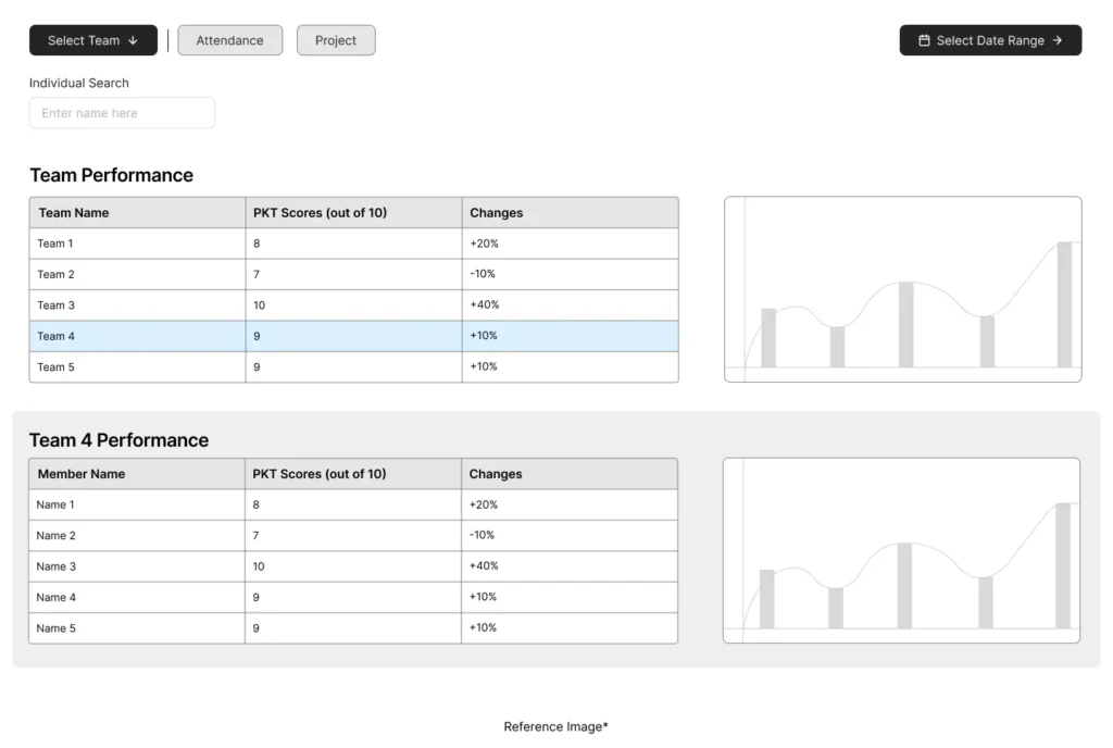
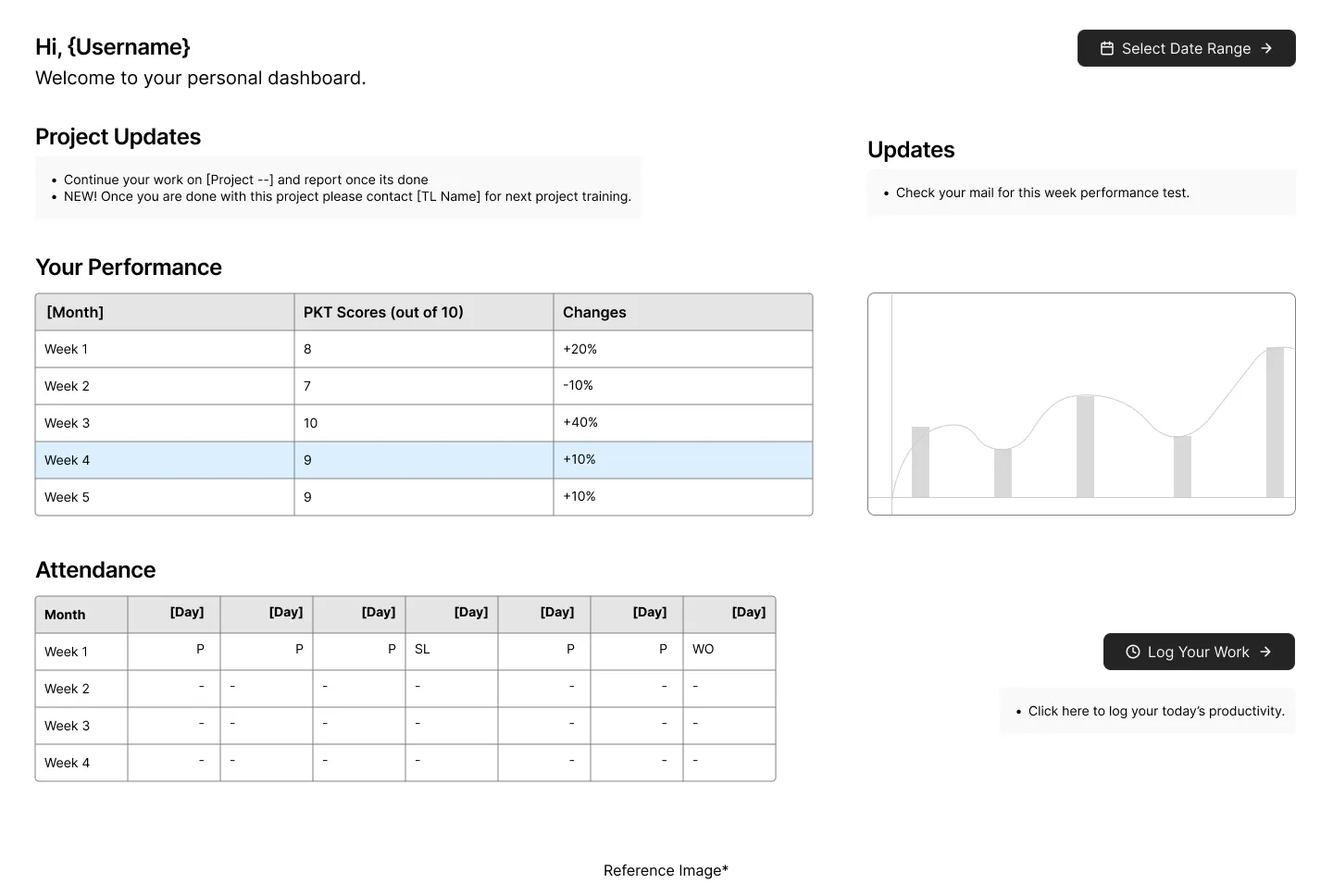
Turns out, we had info on attendance (you know, who’s showing up and who’s taking a ‘sick day’ 😉), what projects people were working on, and even their PKT scores (basically, weekly tests to see how sharp they are on their processes).
Why Spacing Matters:
- Readability: Proper spacing between lines of text and paragraphs improves readability, making your content easier to consume.
- Visual Hierarchy: Spacing can be used to guide the user’s eye, highlighting the most important elements first.
- Emotional Impact: A well-spaced design can evoke feelings of calm, clarity, and sophistication.
Guiding Principles for Spacing:
- Visual Hierarchy: Use spacing to emphasize important elements.
- Proximity: Group related elements together to create a sense of order. (More on this in the next section!)
- Alignment: Align elements to a grid or baseline for structure.
- Negative Space (White Space): Use empty space to avoid clutter and create a clean look.
- Micro-Spacing: Pay attention to small details, like the spacing between lines of text or elements within a group.
The Solution: Building the Management Dashboard
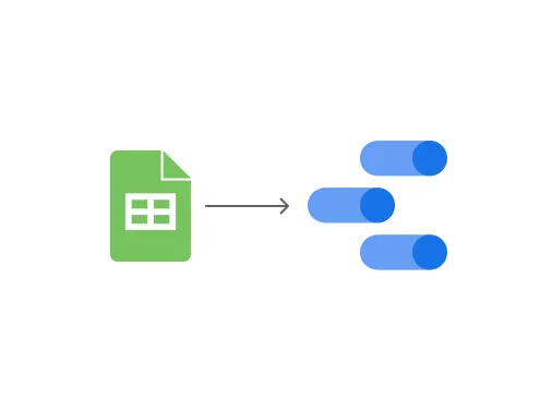
Now, my goal was to get all that juicy data from their individual spreadsheets into my master spreadsheet. I had this grand vision of a sheet with everyone’s names, emails, and all the important dates… like a super-organized phone book. At that point, I really wished I was in IT and could just get someone to write some code for me. But, no such luck! So, I rolled up my sleeves, dove into Google Sheets formulas, and started building this crazy mechanism to automatically gather data from all those different sheets and neatly arrange it into my master sheet. And, of course, it had to be in the exact format that Google Data Studio needed to create the dashboard I was dreaming of.
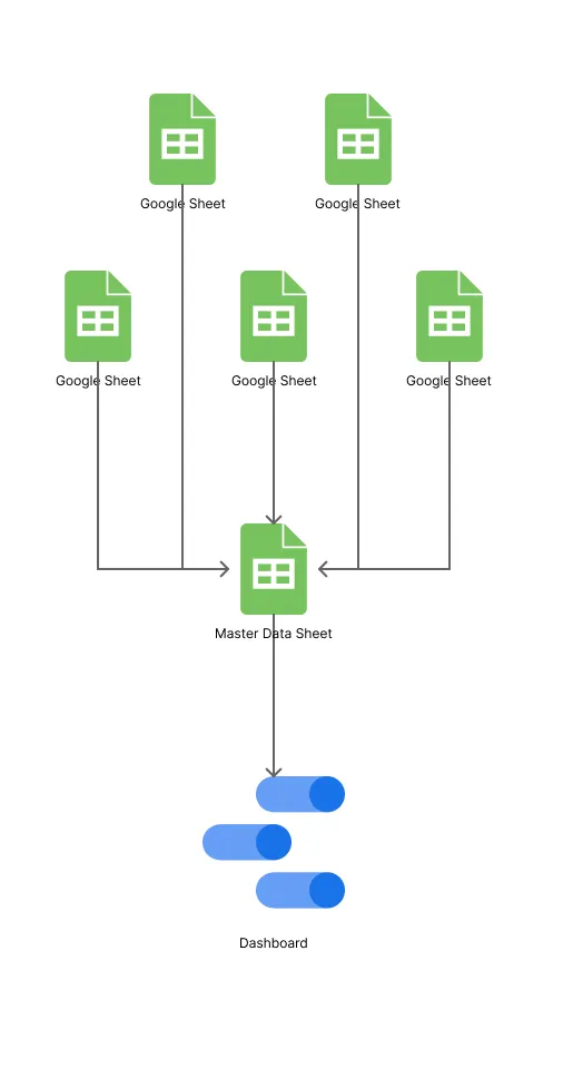
With the data in hand and a vision in mind, I teamed up with my trusty TL (that’s ‘Team Lead’ for you non-corporate folks 😉) to crack the Google Sheets formulas. Together, we wrestled those spreadsheets into submission and created a master sheet that was a thing of beauty.
Next up, Google Data Studio! I dove headfirst into tutorials and started piecing together my dashboard. (And here’s a fun fact: I ended up making some major improvements later on, opening up the dashboard to every team member — more on that later!).
The feedback on the dashboard was awesome! People were genuinely excited about how much easier it made things. But, I started thinking, “This is great, but it’s not something you need to check every single day, right?” Plus, management still had to go back and forth between different spreadsheets to update their data. It was like we’d taken one step forward, but still had a bit of a clunky workflow.
Next up, Google Data Studio! I dove headfirst into tutorials and started piecing together my dashboard. (And here’s a fun fact: I ended up making some major improvements later on, opening up the dashboard to every team member — more on that later!).
Going the Extra Mile: Empowering Team Members
So, I had another lightbulb moment: why not bring those spreadsheets right into the Data Studio dashboard itself? (Yeah, Data Studio actually lets you do that!) That way, they could update everything in one place, no more spreadsheet hopping.
Disclaimer: To all you Data Studio pros out there, I know this might not be the most elegant solution. But hey, I was working with what I had, learning these tools on the fly, and trying to make things better for my company. No fancy resources or IT department at my disposal!
So, management was happy, but what about the team members themselves? There were a lot of them, and I thought, ‘Hey, why not give them a little quality-of-life upgrade too?’ No one asked for it, but I figured, why not? 🤷♀️
Here’s the deal: sometimes people would show up to work, only to find out their assignments had changed. Maybe their manager wasn’t around to give them the update, so they’d just default to their usual tasks. Not a huge deal once in a while, but when it happens all the time, it gets frustrating. I wanted to create a system where people could walk in, see exactly what they needed to do that day, get it done, update their progress, and head home. Simple, right?
So, I started building another dashboard, but this one was just for individual team members. They could see their own data, and no one else’s. I also added some extra tabs to the spreadsheets for team leads, where they could assign tasks directly. Easy peasy! The team lead just goes to your name in the sheet, types in the task, and boom! You see it on your dashboard the next day.
Now, this was the tricky part. Getting Data Studio and Google Sheets to play nice with all these filters was like herding cats! We’re talking spreadsheets with thousands of rows… it was a wild ride, but I managed to make it work.
The Impact: Positive Feedback, Then an Unexpected Turn
And finally, it was time for the big reveal — FEEDBACK TIME! 🎉 The response was overwhelmingly positive. People loved how the dashboards made their lives easier. Sure, there were a few minor tweaks here and there (I didn’t have full editing access in Data Studio, so some things were a bit tricky to change). But overall, everyone was happy… at least for a while. 😔
Unfortunately, the company closed its doors a month later, so my dashboards didn’t get the long-term run they deserved. But hey, at least I got to make a positive impact while it lasted! And it was a fantastic learning experience for me.
Lessons Learned: My Journey into UX
So, what did I learn from all this? Well, it turns out I love solving problems and making things easier for people. I had all this knowledge about users, management, and how they work, but building that dashboard showed me a whole new way to put those skills to use. It was something I could get lost in for hours, even days!
That’s when I decided to make the switch to UX. I tried my hand at Data Studio for a bit (it’s more complicated than it looks!), then dabbled in web design (code is not my cup of tea ☕). Finally, I discovered Figma and the whole world of UX design… and it felt like coming home!
Talk about a roundabout way to find your career path, right? 😂 Anyway, if you’re looking for someone who’s passionate about solving problems and creating user-friendly experiences, hit me up!