Forced Signups vs. Exploration: PicsArt’s Onboarding Dilemma
Have you ever downloaded PicsArt, excited to start editing, only to be bombarded with “Subscribe Now!” pop-ups before even trying the app’s basic features? Yeah, me too. It’s frustrating, and frankly, makes me question if the app is even worth my time.
That’s why I decided to take a closer look at PicsArt’s onboarding process. Don’t get me wrong, they DO have cool tools. But getting to them feels like an obstacle course designed to wear you down into paying.
This analysis isn’t just about complaining. I’ll break down exactly where PicsArt’s user experience goes wrong, how it makes users like us feel, and most importantly, propose some alternative ways they could have done it that benefit both them AND their potential customers.
- We seize opportunities to innovate and grow
- We are one firm with a shared sense of purpose
- We care about each other and the world around us
What are Problems here?
Have you ever downloaded PicsArt, excited to start editing, only to be bombarded with “Subscribe Now!” pop-ups before even trying the app’s basic features? Yeah, me too. It’s frustrating, and frankly, makes me question if the app is even worth my time.
That’s why I decided to take a closer look at PicsArt’s onboarding process. Don’t get me wrong, they DO have cool tools. But getting to them feels like an obstacle course designed to wear you down into paying.
This analysis isn’t just about complaining. I’ll break down exactly where PicsArt’s user experience goes wrong, how it makes users like us feel, and most importantly, propose some alternative ways they could have done it that benefit both them AND their potential customers.
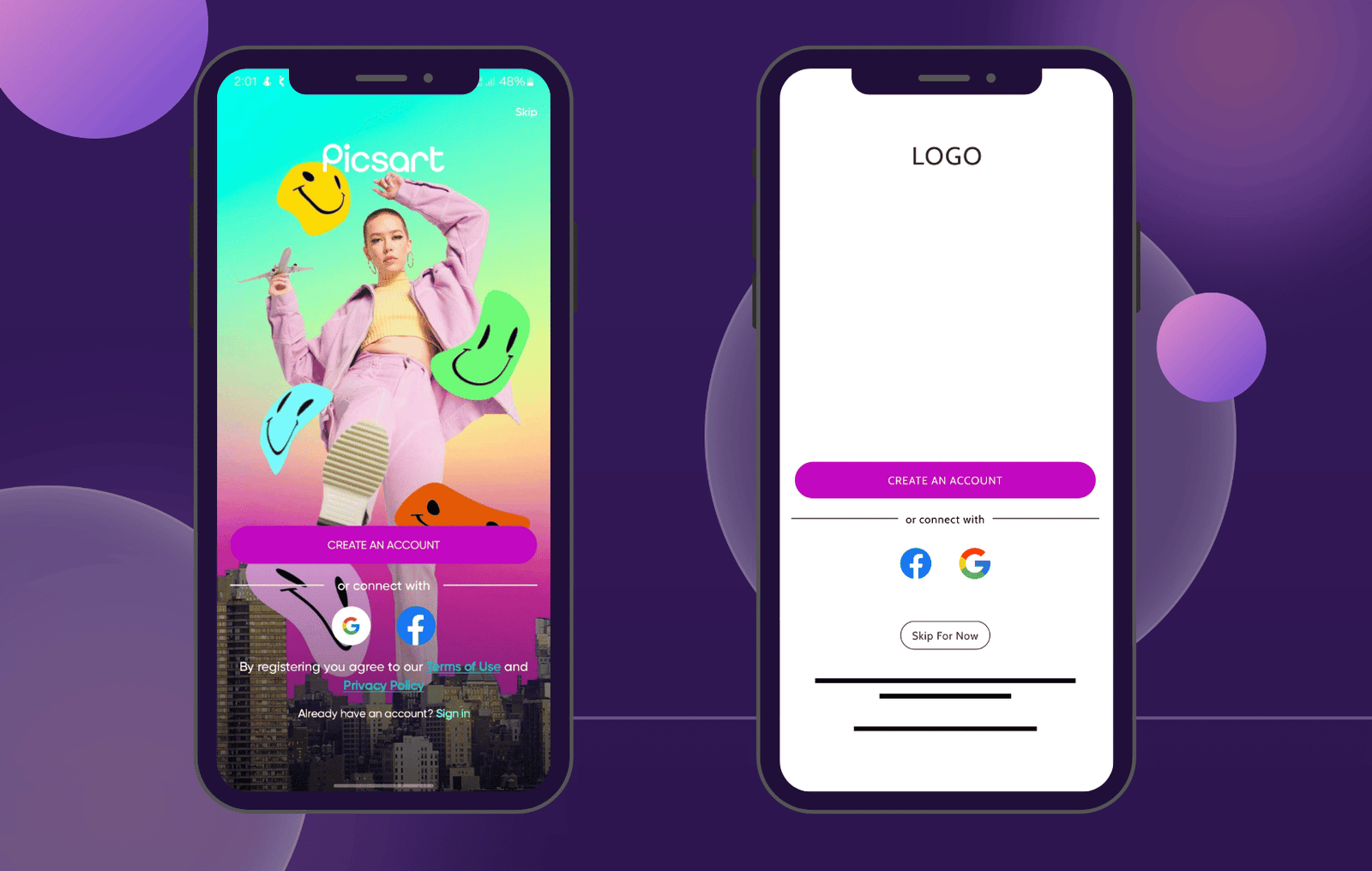
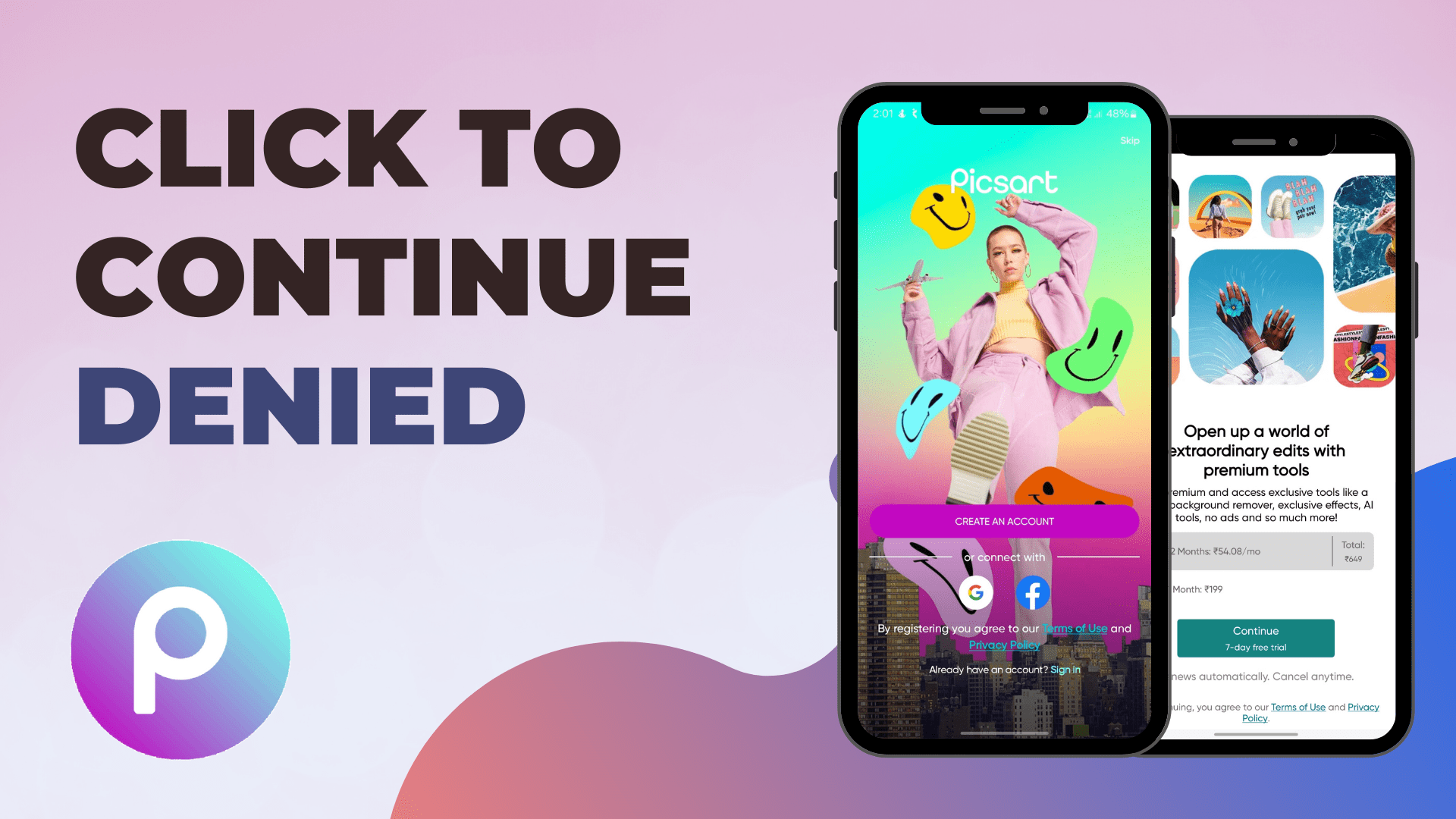
Problem #1: The Paywall Welcome
- Think you’re downloading a cool editing app to try? PicsArt has other plans. Instead of being greeted with excitement and creative possibilities, you’re immediately slammed with full-screen upgrade demands before you can even test a single filter.
- It’s less a welcome and more like hitting a paywall before you’ve even stepped inside the amusement park.
- This sets the tone for the entire experience: pushy and money-focused, rather than showcasing the features that drew you to the app in the first place.
- It makes you wonder: If they’re this aggressive before I even try the app, what other hoops will I have to jump through if I actually want to use it regularly?
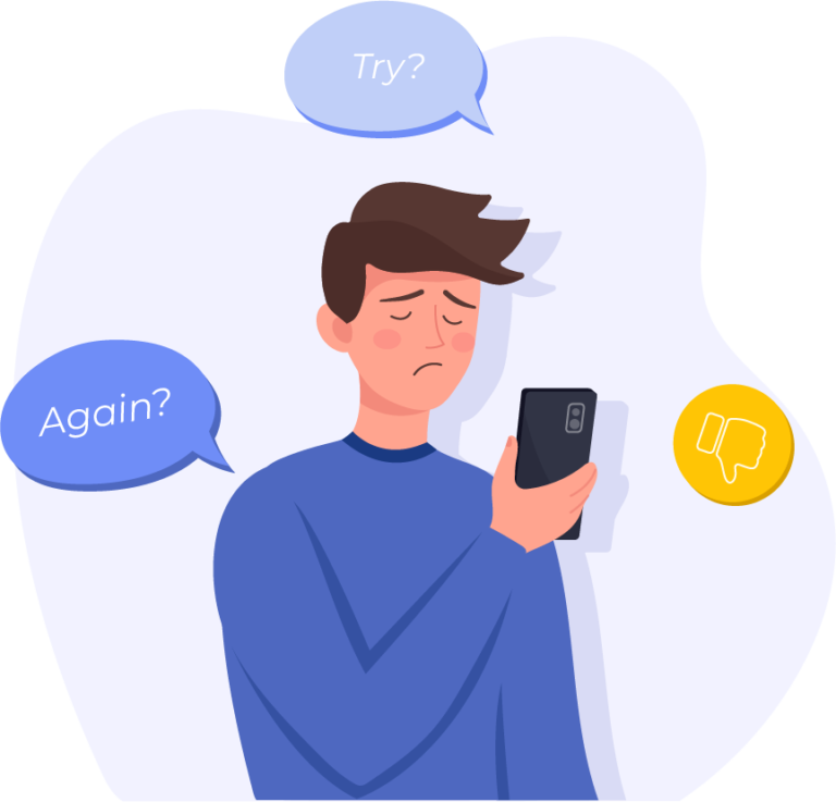
Problem #2: The Repeat Offender
- Every time you open PicsArt? Back to square one. They insist on the login/signup screen, ignoring previous “skip” choices, creating a constant barrier to actually using the app.
Problem #3: The Hunt for “Skip”
- PicsArt plays hide-and-seek with the “Skip” option, tucking it away in a corner as if they don’t want you to find it.
Problem #4: Features Held Hostage
- It’s frustrating because PicsArt genuinely offers a wide range of useful editing features, but users should be allowed to explore these features more extensively before being confronted with a subscription page.
Problem #5: The Privacy Barrier
- This forced registration push also raises privacy concerns. Users who want a casual try-before-you-buy experience may be hesitant to hand over personal data before they even see if the app suits their needs.
Building Trust, Not Barriers: Why PicsArt Should Rethink Onboarding
PicsArt’s aggressive onboarding is a classic case of short-term thinking harming long-term growth. Think of all the potential users they drive away! Casual creatives, hobbyists, budding artists…anyone who might become a devoted fan is likely turned off by the pushy upsells before they even experience the features that make PicsArt valuable.
This approach also damages trust. Even if their privacy policies are sound, demanding sign-in before you can explore the app raises concerns for today’s privacy-conscious users. In a competitive app market, PicsArt risks losing out to apps that offer similar features with a more respectful user experience, tarnishing their reputation long-term.
A Smoother Start: Redesigning PicsArt’s Onboarding
My proposed solution prioritizes a positive first impression. The full-screen signup demand is replaced with a clear “Skip for now” button, positioned prominently yet below the registration options. This allows new users to immediately dive into the editing experience, demonstrating PicsArt’s value before asking for a commitment.
To maintain a balance between user experience and monetization, upsell prompts could be strategically integrated into the workflow (e.g., when attempting to use a premium feature). This ensures visibility without disrupting the creative process.
User experience should be a priority, not an afterthought. Through thoughtful onboarding design, PicsArt has the potential not only to improve their app, but to set an example for respectful, user-centric practices within the industry.
This is just one observation, and I’m always eager to improve my UX design skills. If you have any apps that nail their onboarding, or any tips to share, please let me know in the comments! Your insights would be super valuable.