Uncover the secret weapon of great UX design: spacing and proximity. This no-nonsense guide reveals how to use these essential principles to create intuitive, visually stunning, and emotionally engaging interfaces.
Introduction
Hey there, fellow designers! Ever looked at a design and thought, “Something’s just…off?” Chances are, it’s the spacing. I know, spacing and proximity aren’t the most glamorous aspects of design, but they’re the secret sauce behind those interfaces that just feel right.
Think of it this way: spacing is like the breath of fresh air your design needs to avoid feeling cramped and cluttered. It’s also about guiding the user’s eye, creating visual order, and even evoking emotions. Get it right, and you’ll create designs that are both beautiful and intuitive.
- We seize opportunities to innovate and grow
- We are one firm with a shared sense of purpose
- We care about each other and the world around us
Spacing: More Than Just Empty Space
Spacing isn’t just about empty areas on your screen; it’s an active design element that plays a crucial role in how users perceive and interact with your interfaces. It’s not just about aesthetics; it’s about functionality and emotion.
Why Spacing Matters:
- Readability: Proper spacing between lines of text and paragraphs improves readability, making your content easier to consume.
- Visual Hierarchy: Spacing can be used to guide the user’s eye, highlighting the most important elements first.
- Emotional Impact: A well-spaced design can evoke feelings of calm, clarity, and sophistication.
Guiding Principles for Spacing:
- Visual Hierarchy: Use spacing to emphasize important elements.
- Proximity: Group related elements together to create a sense of order. (More on this in the next section!)
- Alignment: Align elements to a grid or baseline for structure.
- Negative Space (White Space): Use empty space to avoid clutter and create a clean look.
- Micro-Spacing: Pay attention to small details, like the spacing between lines of text or elements within a group.
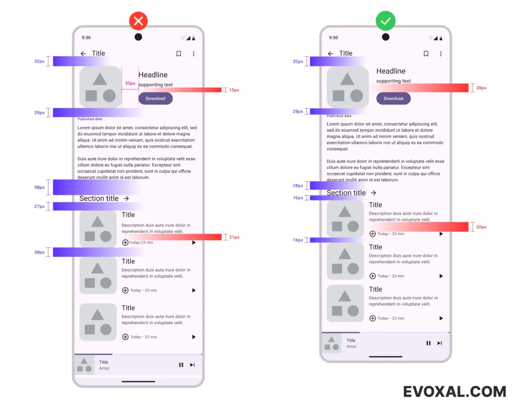
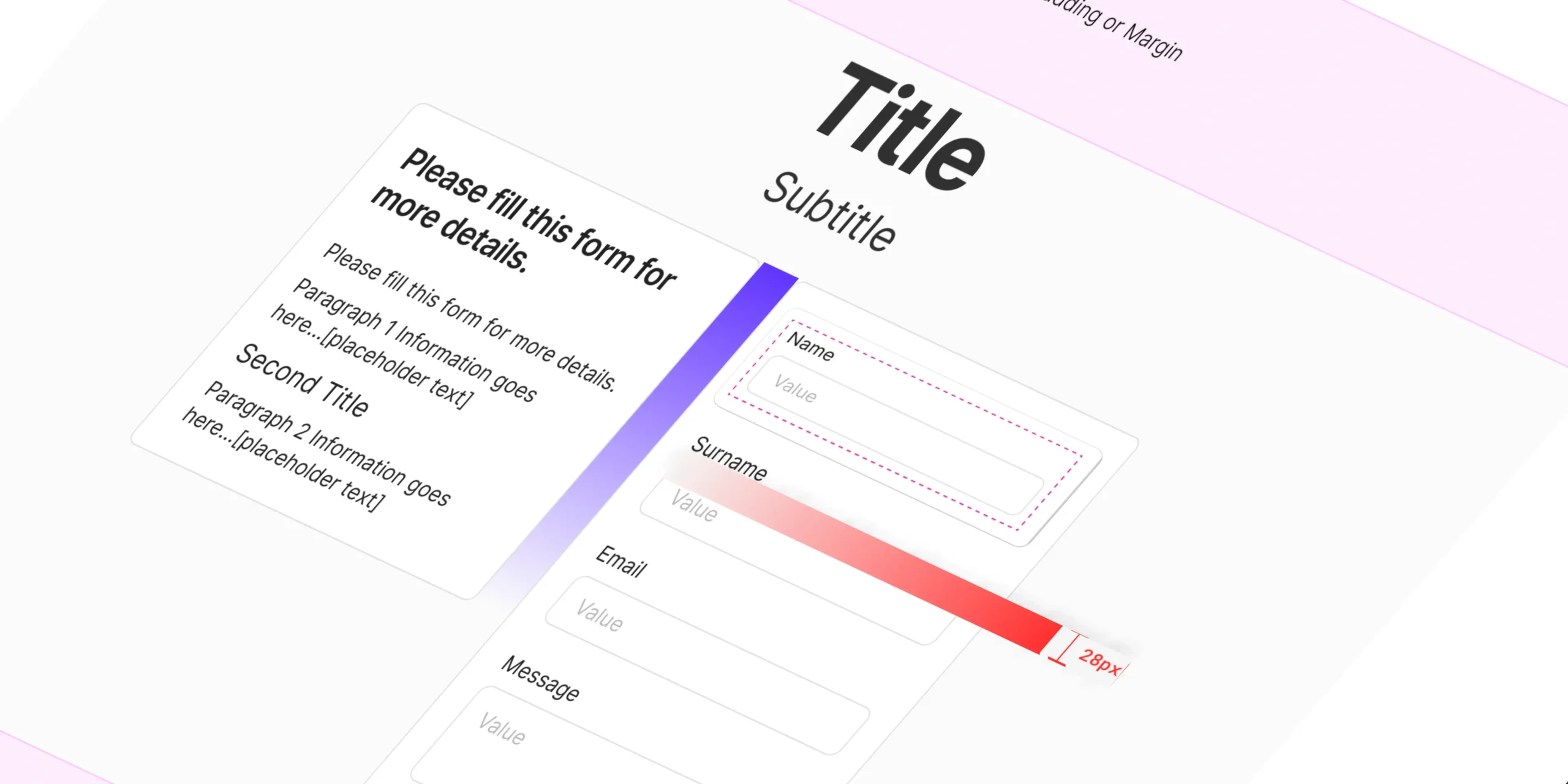
Uneven vs. Even Spacing
In the example on the left, the random spacing makes the design feel chaotic. The right side, with consistent spacing, is much easier on the eyes and creates a clear visual hierarchy. Notice how the red micro-spacing (within elements) and purple macro-spacing (between groups) work together to create a harmonious layout.
Spacing Guidelines: A Starting Point
Most designers use multiples of 4, 8, or 16 pixels for spacing (e.g., 4px, 8px, 16px, 32px). This is because our eyes naturally find even numbers visually pleasing. These are just guidelines, though, and you should always trust your design instincts.
Proximity: The Art of Grouping
Proximity is about grouping related elements together. This helps users understand which elements are connected and makes your design easier to navigate.
When you group related elements in your design, you’re telling users, “Hey, these guys are a team. They go together.” It makes your design easier to understand and helps users navigate it with ease. This is grounded in something called the Gestalt principles of grouping, which basically say that our brains are wired to see patterns and relationships.
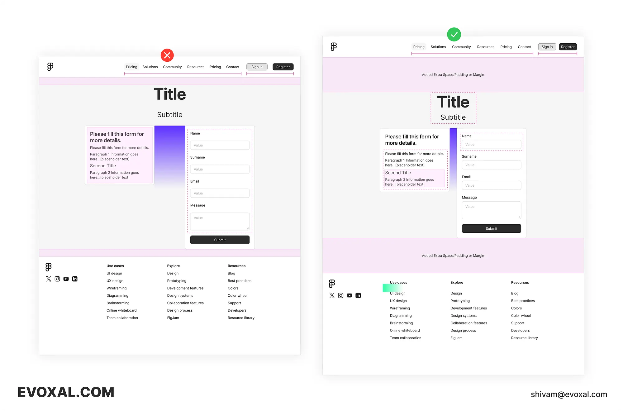
Uneven vs. Even Proximity
The example on the left lacks intentional grouping, making the layout confusing. On the right, we’ve grouped related elements and used spacing to separate them, creating a clearer hierarchy and a more intuitive user flow.
Let’s break it down:
- Navigation Bar: In the messy version, the navigation options and the login/signup buttons are all crammed together, making it hard to tell what’s what. On the right, we’ve separated these two groups with spacing, making it crystal clear which actions are for navigation and which are for user accounts.
- Header and Footer: Adding extra padding between the header, footer, and main content ensures they don’t visually bleed into each other. This creates a sense of hierarchy and lets each section shine.
- Title and Subtitle: We’ve snuggled the title and subtitle up close together, showing they’re a unit. But we’ve also given them some space from the body text below, so they don’t get lost in the shuffle.
- Content Sections: See how the purple spacing acts like dividers between different content sections. It’s like saying, “Hey, these are two different topics, but they’re still part of the same page.”
- Input Fields: Notice how squished the input fields look on the left? By adding more space between the labels and the fields, we’ve made it much easier to tell them apart.
- Footer Navigation: The footer titles are bold, but they’re so close to the list items that it’s hard to tell which is which. By adding a bit of space, we’ve made the titles stand out as headings, not just another link.
This example shows you how even small tweaks to proximity and spacing can have a dramatic impact on the clarity and overall feel of a design. It’s not just about aesthetics; it’s about making sure users can easily understand and navigate your content.
Beyond the Grid: Intuitive Spacing and Grouping
While grid systems are a helpful tool for maintaining consistency, don’t let them become a creative crutch. Sometimes, the most interesting and effective designs break the grid, using intuitive spacing and grouping to create visual interest and hierarchy.
Think of it like playing jazz music. Sure, there’s a basic structure and rhythm, but the best musicians know when to improvise and add their own flair. The same goes for design. Don’t be afraid to experiment and find your own unique rhythm with spacing and proximity.
Spacing and Proximity in the Real World
Let’s take a look at how spacing and proximity principles are applied in the real world. Check out some of your favourite websites or apps. Notice how they use spacing to guide your eye and group related elements together.
Think about typography, for example. The space between lines of text (leading) and the space between letters (kerning) can dramatically impact readability. Or consider how icons are often grouped together with labels to create clear navigation elements.
By paying attention to how spacing and proximity are used in successful designs, you can start to develop your own intuition for these principles.
To truly master the art of intuitive spacing, it’s helpful to understand the psychological principles at play. This article on Gestalt theory and proximity provides a great starting point: [link]
The Future of Spacing and Proximity
The world of design is constantly evolving, and spacing and proximity are no exception. New technologies, like variable fonts and AI-powered layout tools, are giving designers more flexibility and control over spacing decisions.
But even with these advancements, the fundamental principles of spacing and proximity remain essential. As you continue to learn and grow as a designer, focus on honing your intuitive understanding of these concepts. This will allow you to create designs that are not only visually appealing but also functional, user-friendly, and emotionally resonant.
Conclusion
Spacing and proximity are fundamental to good UX design. They’re not just about making things look pretty; they’re about creating experiences that are intuitive, engaging, and emotionally resonant.
So, take the time to understand the nuances of spacing and proximity. Experiment, play around, and find what works for you. And most importantly, don’t be afraid to break the rules and let your creativity shine. After all, the best designs aren’t just functional; they’re also beautiful, and that’s where spacing and proximity truly come to life.
Your Turn:
Now that you’ve learned the secrets of spacing and proximity, it’s time to apply them! Look at your own designs with fresh eyes and see where you can make improvements. Share your before-and-after examples in the comments below!